Price Action Technical Analysis Reveals the Footprint of Money » Learn To Trade The Market

Price action is the movement of price over time, this movement leaves behind a ‘footprint’, the footprint of money. This footprint, once understood properly, reveals to us the story on the chart…
Price action analysis is the act of analyzing and making sense of the footprint of money on the chart. By understanding this footprint, we can begin to put together a ‘story’ of the market, one bar at a time. These footprints are price bars, and they show us the behavior of all market participants; the ‘big boys’, smart money, hedge fund managers, and even the not so smart money.
By analyzing and following the footprint left behind as the price action develops over time, we can read what is happening on a chart, what has happened and what might happen next. Reading a chart is not just about “technical analysis”, it’s about understanding and making use out of the psychology of the market that is ‘hidden’ in the price bars. In this lesson, you will discover what reading the charts bar-by-bar and then using that to get a bird’s eye view, will do for your trading…
The psychology of price bars and reading the market like a book
Price action, for those who are new here, is essentially the ‘footprint’ that is left behind as price moves over time, this price action footprint is visible by looking at a price chart of any market or trading instrument. For an expanded definition of price action, read my introduction to price action here.
Each individual price bar is essentially a reflection of the collective psychology of all market participants for the time period the bar represents. For example, on a daily chart time frame, each price bar is showing whether bulls or bears won the battle that day. We can drill-down further and dissect each price bar according to how long or short its tail / wick / shadow was as well as the total length of the bar and a few other features.
The psychology of individual price bars is something that has been studied for hundreds of years, ever since Munehisa Homma, the first price action trader, began using candlestick charts in the 1700’s. Homma discovered that by tracking the price movement of a market over time (price action / footprint of money), he could actually see the psychological behavior of other market participants and use that data to develop a trading strategy.
Moving beyond indicators, trading systems and all the online trading hype, by simply reading a ‘naked’ price chart we are able to read the market like a series of chapters in a book; the story reveals itself from left to right over time.
What are the primary focus points when reading a chart from left to right?
- Reading the price action and technical analysis of charts will reveal a lot of data and it’s much more than just bars and lines, it’s psychology, market sentiment and bringing it all together to form an actionable plan of attack.
- We can interpret the story by reading the charts like a book, from left to right; what happened earlier in the chart / book usually has an impact on what is happening currently and what might happen next.
- Each individual price bar has something to say and plays a role in the story the chart is telling you.
- The most obvious piece of data we see when we look at a chart is the direction of the market or the trend. We also will easily notice whether the market is making big directional swings or smaller / shallower swings. Note: Currently, many markets are experiencing big / deep directional swings.
- We also want to make note of whether a market is respecting technical levels (support / resistance, moving averages, etc.) consistently. By analyzing the footprint of money and reading the story on the charts, we can see whether a market is respect key technical levels and if is is, this means it’s a good time to look for trades. Currently, we are in a structured market that is respecting key levels, trending well and signals are forming with price moving in the direction of the signal more often than not.
- We want to take note of how price is behaving around key levels, if it’s not respecting them, then what is it doing? Is it shooting past them without so much as a thought? If so, that tells us a lot as well, it tells us that the direction of the level break has a lot of momentum being it, so look to trade in that direction.
Each of the points above are things we want to look for as we read the chart from left to right. They each help us to understand the psychology of the chart and give us the ability to ‘paint’ a picture of what might happen next. Think of the story the market is telling you as a “window into the future”; you don’t always know what the future will hold, but when you study past events and how they connect to current events, you can make a very good educated guess.
Our aim, as price action analysts, is to see and read the market by using the price action analysis model; bars, levels, trends, interpreting price action signals, etc. The day-to-day flow of money and day-to-day price strength vs. weakness is revealed by individual daily and weekly price bars (I use candlestick bars).
For example, price action analysis allows us to spot potential ‘traps’ in the market, like false breakouts and fakey patterns, these patterns reveal where the market is being manipulated by the “smart money players” and which direction it may reverse into. In this way, the price action, the footprint of money, allows us to see inside the smart money minds; to actually see what they’re thinking based on what they’re doing. This is how we read the psychology of the market on a bar-by-bar basis. We will look at some chart examples of this to follow…
How to Read the ‘Footprint’ of Money…
Now, let’s get into the nitty-gritty of this, let’s walk through 4 different charts and analyze the price action from left to right. These charts will go from easy to more difficult so that any newer traders reading this get a better feel for how I follow the footprint of the price action to develop a story on the charts, so that I can make an educated guess as to where to look for my next trade…
Chart 1. – Reading the chart from left to right
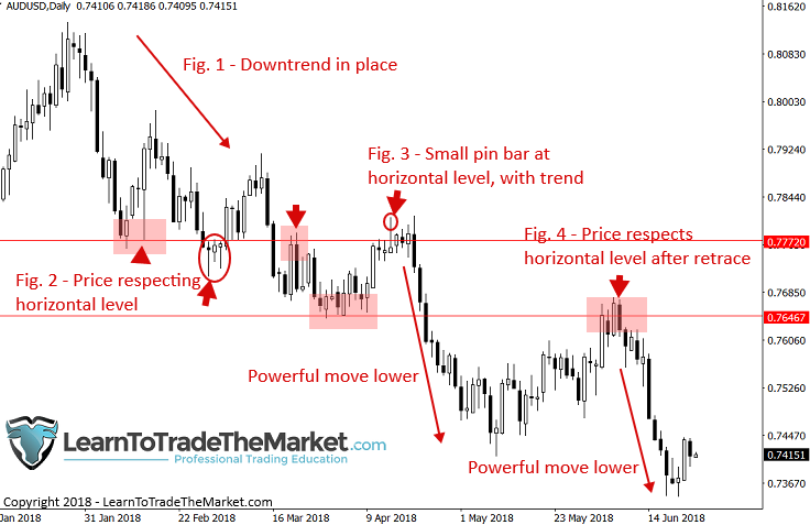
In the chart below, we are reading the story on the AUDUSD daily chart time frame:
Figure 1. – The first thing we are noticing, starting from the right side of the chart is that the overall daily chart trend was down, lower highs and lower lows were being printed. This gives us our bias – bearish, we are looking to sell.
Figure 2. – Next, we want to identify obvious horizontal levels of support or resistance, drawn at the major market swing points / turning points. These levels are where we will focus our attention in the future for potential price action trade setups.
Figure 3. – Notice, a small bearish pin bar formed, at the existing swing point (previous swing low which is now resistance), this pin is in-line with the downtrend as well. Thus, we have a T.L.S. setup or Trend, Level, Signal, and when you get all three of these it’s like a golden hen that will often give golden egg trade setups.
Figure 4. – After the powerful down move that took place following the previous pin bar signal, price retraced higher over the next few weeks, back up to re-test that previous swing low / resistance level. We can see that after a brief pause back at that resistance, price sold-off heavily again, providing traders who missed the first move with a potential second-chance entry into this down-trending market.

Chart 2. – Analyzing individual price bar psychology
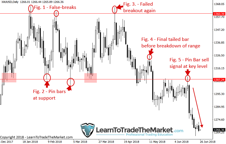
In the chart below, we are following the smart money price footprint on the daily Gold chart:
Figure 1. – Notice the false breakout above the level near 1360. There was an existing resistance level near 1360 from back in 2017. The upper tail on the bar indicates the psychology of the market – buyers ran out and became exhausted, the amateurs bought into the breakout of the level only to see the bigger players come in and push price lower.
Figure 2. – We can see two obvious bullish pin bars that formed near a key support at 1307 area. We would be leaving both this 1307 support and 1360 resistance on our charts to watch the price action at these levels into the future. At this point, a clear trading range was established and the story on the chart is that price is oscillating between these levels and the weaker hands are getting flushed out at the boundaries of the range by trying to anticipate a breakout before it actually happens.
Figure 3. – Yet another false breakout of resistance, you can see how repetitive humans are and how they do not learn – they will do the same thing over and over, the good thing is, you can profit from their ignorance! Watch for these long tails at key levels, especially in trading ranges, and fade them or trade the opposite way, back into the range.
Figure 4. – Notice, after several days of consolidation near the trading range support, after a moderate pop higher price formed a bearish tailed bar, a clear warning sign that price would not make another surge up to the trading range top. After this warning signal, we can see price capitulated, finally breaking down and out of the trading range for good. When you see a powerful close outside of a range, followed by several more days of consolidation / closes outside the range, as we see here, then it’s safe to assume the breakout is real.
Figure 5. – Now that the breakout has been confirmed we can look to trade in-line with that direction (down). Notice after a few weeks of consolidating under the range support, price tried to poke back up above it, only to get pushed lower by bears, forming a small pin bar sell signal before another big sell-off.

Chart 3. Price bars reveal contrarian opportunities
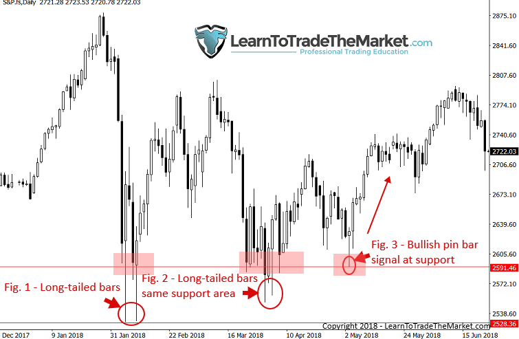
In the chart below, we are analyzing how price bars can reveal contrarian trading opportunities.
Figure 1. – After a very aggressive and some might say “scary” sell-off, the S&P500 reversed dramatically, putting in two long-tailed bullish bars that to the professional, indicated an up-move was coming soon. Most amateurs were still feeling the intense sell-off and not ready to buy at this point. Again, pay more attention to WHAT THE PRICE ACTION is telling you than what your feelings are telling you. At the time, this would have been a very contrarian feeling buy entry – everyone had just liquidated shorts and were afraid to buy. Just remember, when everyone is afraid, you want to buy, when no one is afraid, you should be getting afraid and looking to sell!
Figure 2. – After a nice move higher from the aforementioned bullish tailed bars, price pulled back to that same support area, forming a couple more obvious bullish tails that showed a false-break of that support, again indicating an up move was likely in store.
Figure 3. – If the previous two opportunities were not obvious enough, we got a third one, a very nice-looking pin bar buy signal at the same support level as the last two opportunities. Notice how trades like this can take weeks or months to develop, but when they do, you need to act. Having followed this story on the chart up until that last pin bar formed, you would have known what to do at the time – BUY!

Chart. 4. What can we learn from failed price action signals?
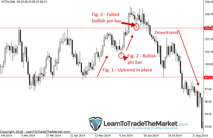
In the chart below, we are looking at what failed price action signals can tell us.
Figure 1. – Looking from left to right, we can see a clear uptrend was in place as price bounced from $99.00 support in Crude Oil. Thus, we would have been looking to buy this market on bullish signals.
Figure 2. – After a modest pullback, a bullish pin bar formed, price pushed higher as we might expect, netting anyone who traded this pin bar a nice profit.
Figure 3. – As price pulled back again and formed a similar pin bar to Fig. 2. we saw little to no follow-through. Instead, price just consolidated for several days after this pin bar formed, even forming a couple bearish tails within that consolidation. Once we saw price close under the low of the pin bar, we knew that pin was likely to fail / failing. We can see what happened next. A failed price action signal like this can often be a signal unto itself, telling us to look at the opposite side of the market now.

I hope from the above images you can begin to understand how I analyze the story on the charts and how important individual price bars can be. The best way to get more familiar with the process of interpreting the story the market is telling you, is by analyzing the footprint the price action leaves on the charts.
I recommend you track this in a trading journal by making a daily diary of your favorite markets, noting down the things discussed above; trend, key levels, any signals that formed and what happened after them. Doing this five days a week like I do in my daily members market commentary, is an excellent way and really the only way to maintain the intimate connection to the market that you need to accurately understand what the market is saying to you.
Starting tomorrow…
When you open your charts tomorrow, I want you to refer back to this lesson and get a pen and paper out. Begin to analyze the market from left to right, as I have done for you here. Keep your trading journal / diary in a notebook and you will begin to understand what I mean by the ‘story’ the market is telling. You will start feeling a connection with the market, and if you do this long enough you will develop your trading intuition which will act almost as a ‘sixth sense’, helping you to quickly identify high-probability trading opportunities in real-time, as they form.
The primary points to take away from today’s lesson are:
- Price action is literally the ‘footprint’ of money across a chart, allowing us to see the behavior of all market participants.
- We can learn how to interpret this price action and the market psychology it represents to put together the ‘story’ being told on the chart.
- Individual price bars each play a role in the market’s story, so learning to interpret their meaning is critical.
- Begin analyzing your favorite markets every day and tracking your notes in a trading diary. This will help you better understand the story the market is telling and what might happen in the next ‘chapter’.
Final Thoughts:
Mastering the art of reading price action has taken me 16+ years, thousands of hours of study and thousands more hours of real live trading screen time. This blog and the 500+ lessons I have authored, as well as my Professional Price Action Trading Course are here to help you dramatically fast-track your knowledge and help you achieve trading success sooner. All of the trading tutorials I have produced for my students since 2008 are the exact type of real world education resources I wish I had access to when I started my trading journey all those years ago. If you apply yourself and stick with the core philosophies of reading price action bar by bar and keeping your overall trading methodology simple, then your chances of making it in the world of professional trading are increased substantially.
Cheers to your future trading success, Nial.
What did you think of this lesson? Please leave your comments & feedback below!
If You Have Any Questions, Please Email Me Here.


Comments are closed.