Is XAU/USD Ripe for a Break Below Key Support?
Gold, XAU/USD – Technical Outlook:
- Gold has struggled to stay above $2000.
- Key focus is now on US PCE price index and US GDP data later this week.
- What is the outlook and what are the key levels to watch in XAU/USD?
Recommended by Manish Jaradi
Building Confidence in Trading
GOLD TECHNICAL OUTLOOK – NEUTRAL
Developments on the technical charts of gold recently indicate that the bar for a sustained rise is getting higher as US inflation remains stubbornly high just as the economy displays signs of resilience. However, until it breaks below key support, the path of least resistance remains sideways to up for the yellow metal.
Data released on Friday showed US business activity rose to an 11-month high in April, suggesting that the economy is weathering the surge in interest rates. To be fair, Friday’s survey data could be overstating the actual state of the economy. Hard data published gives an impression of a slowing economy, including the labour market and retail sales, just as credit tightening by banks starts pinching households and small businesses. This brings into focus US GDP growth data for the January-March quarter due on Thursday – growth is forecast to have slowed to 2% on-quarter from 2.6% in the previous quarter.
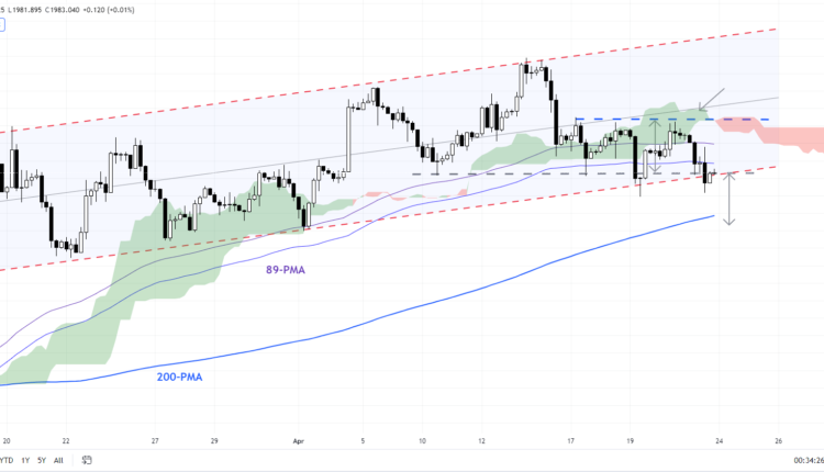
XAU/USD 240-minute Chart
Chart Created by Manish Jaradi Using TradingView
Core inflation measures, including CPI, PCE, and PPI, suggest a gradual cooling in inflation (see chart). In this regard, US PCE price index data due Friday will shed some more light – the core PCE price index is expected to have eased to 4.5% on-year in March from 4.6% in February.
However, any uptick in price pressures could boost US Treasury yields and the US dollar and weigh on gold. Several Fed speakers recently argued for another 25-bps hike. Markets are now pricing in an 89% chance of one more Fed rate hike in May, according to the CME’s FedWatch tool. On the other hand, a softer-than-expected PCE number could push XAU/USD above the $2000 mark.
XAU/USD Daily Chart
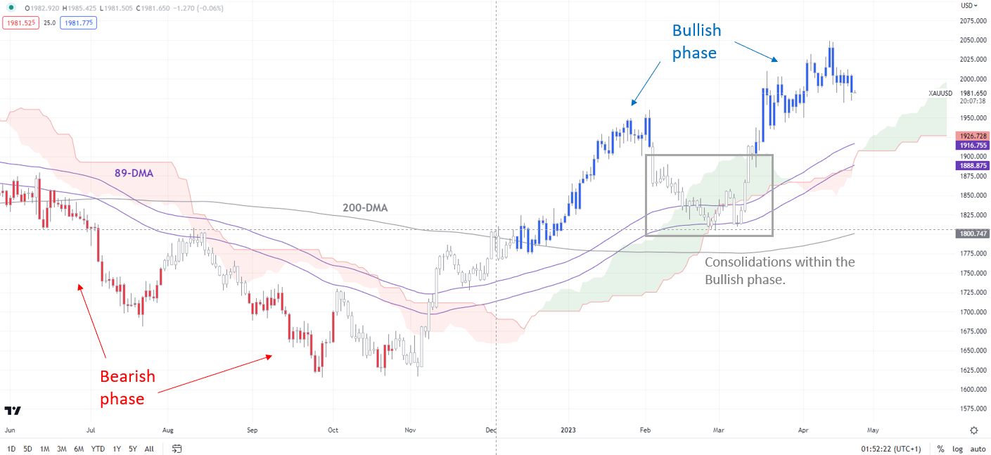
Chart Created by Manish Jaradi Using TradingView
Note: In the above colour-coded chart, Blue candles represent a Bullish phase. Red candles represent a Bearish phase. Grey candles serve as Consolidation phases (within a Bullish or a Bearish phase), but sometimes they tend to form at the end of a trend. Note: Candle colors are not predictive – they merely state what the current trend is. Indeed, the candle color can change in the next bar. False patterns can occur around the 200-period moving average, or around a support/resistance and/or in sideways/choppy market. The author does not guarantee the accuracy of the information. Past performance is not indicative of future performance. Users of the information do so at their own risk.
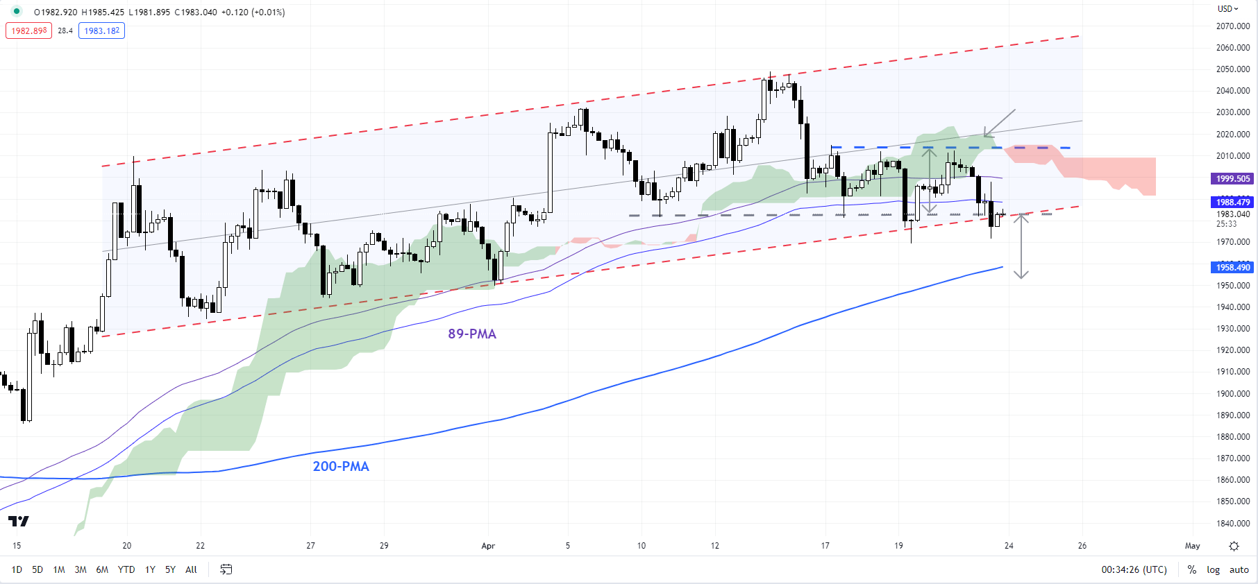
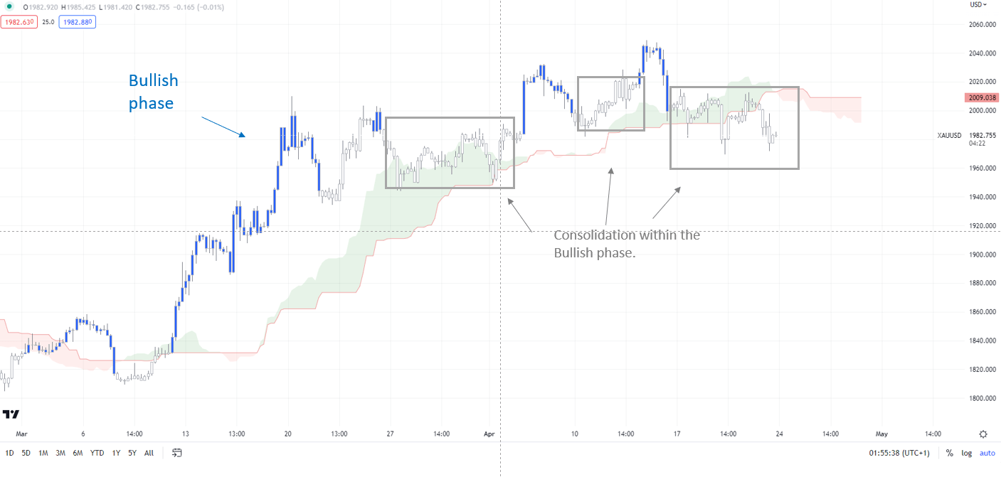
On technical charts, there is no doubt that the broader trend is up – on the daily charts and the 240-minute charts, as the colour-coded candlestick charts, based on trending/momentum indicators suggest. Even on the intraday chart, the recent drift lower indicates a consolidation phase, rather than a bearish phase. (see the daily and 240-minute colour-coded charts).
XAU/USD 240-minute Chart
Chart Created by Manish Jaradi Using TradingView
Note: In the above colour-coded chart, Blue candles represent a Bullish phase. Red candles represent a Bearish phase. Grey candles serve as Consolidation phases (within a Bullish or a Bearish phase), but sometimes they tend to form at the end of a trend. Note: Candle colors are not predictive – they merely state what the current trend is. Indeed, the candle color can change in the next bar. False patterns can occur around the 200-period moving average, or around a support/resistance and/or in sideways/choppy market. The author does not guarantee the accuracy of the information. Past performance is not indicative of future performance. Users of the information do so at their own risk.
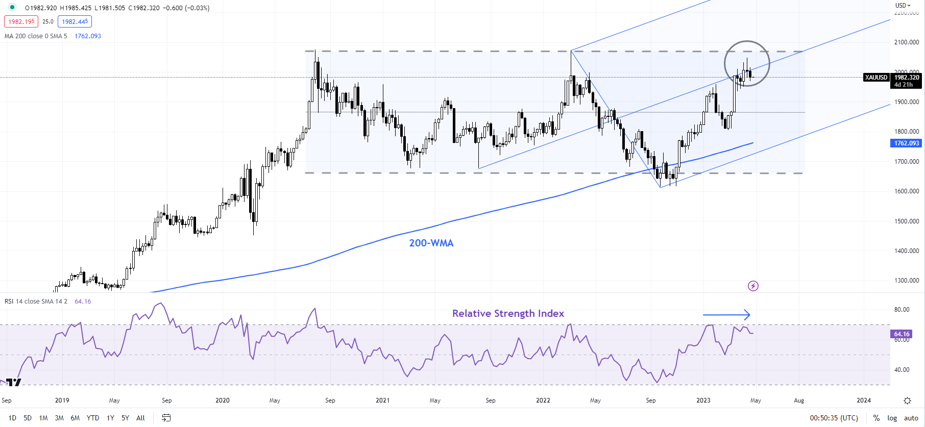
However, it is not so much the near-term price action (that is, the shorter timeframes), but the price action on higher timeframes that provide a reason for caution. This implies that a breakdown may not be imminent, but the foundations of it are perhaps being laid now. For more discussion, see “Gold Could Find it Tough to Crack $2000”, published March 28, and “Gold Weekly Forecast: Is it Time To Turn Cautious on XAU/USD?”, published April 16.
XAU/USD Daily Chart
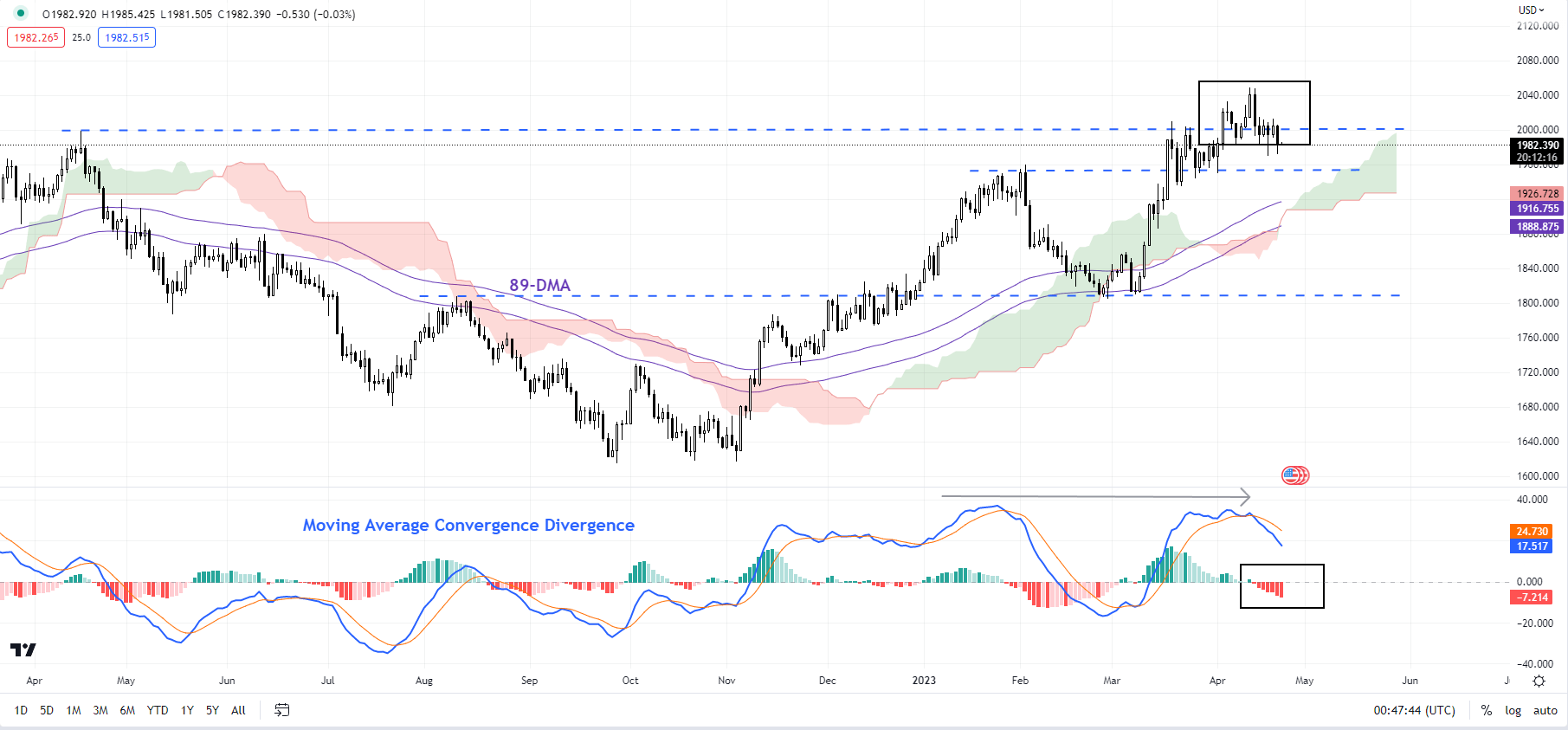
Chart Created by Manish Jaradi Using TradingView
So far, gold has struggled around a tough hurdle around the 2020 peak of 2072, roughly coinciding with the upper edge of a rising pitchfork channel from late 2022. Negative divergence on the weekly and daily charts around this month’s high is a sign that the yellow metal’s rally is losing steam.
XAU/USD Weekly Chart
Chart Created by Manish Jaradi Using TradingView
In the short term, the momentum continues to be down – see the Moving Average Convergence Divergence indicator on the daily chart. Hence, the focus shifts to key support around 1935-1970. So far, XAU/USD has held above the converged support area (see the 240-minute chart). Any break below last week’s low of 1970 could expose downside risks toward 1935. On the upside, XAU/USD would need to decisively break above 2072 for the outlook to turn unambiguously bullish.
Trade Smarter – Sign up for the DailyFX Newsletter
Receive timely and compelling market commentary from the DailyFX team
Subscribe to Newsletter
— Written by Manish Jaradi, Strategist for DailyFX.com
— Contact and follow Jaradi on Twitter: @JaradiManish

Comments are closed.