Chart Art: Silver (XAG/USD) Testing Area of Interest
I’m seeing a textbook correction play on the 4-hour chart of silver!
Will resistance keep holding?
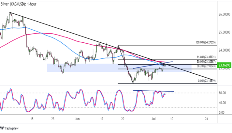
As you can see from the 4-hour chart below, the commodity price made lower highs connected by a falling trend line.

Silver (XAG/USD) 4-hour Chart by TV
Now this resistance zone has been holding since mid-May, so it might still serve as a ceiling this time.
To top it off, the trend line coincides with a former support area around $23.00, the 50% Fibonacci retracement level, and the 100 SMA dynamic inflection point.
Talk about confluence, huh?
The 100 SMA is below the 200 SMA to indicate that the selloff is more likely to resume than to reverse. This might be enough to take silver back down to the swing low at $22.13 or lower.
In addition, Stochastic is reflecting overbought conditions or exhaustion among buyers, so heading back down would mean that sellers are taking over.
I’m even seeing a bit of bearish divergence, as the oscillator made lower highs while XAG/USD had higher highs.
A higher correction could still reach the 61.8% Fib at $23.45, but this might be the line in the sand for a bearish pullback.
Better keep tabs on overall market sentiment and top-tier U.S. data like the NFP release when trading this one!


Comments are closed.